
Initiate
An app to make it happen
A mobile app case study
Role: UX Researcher, UI Designer
Tools: Figjam, Figma, Canva, Google Docs, Google Slides, Zoom, Slack and Trello
What is Initiate?

Initiate is your ultimate companion for bringing your passion projects to life! Whether it's writing that novel, mastering a new instrument, or launching a creative endeavor, Initiate is here to empower you every step of the way. With intuitive tools, personalized guidance, and a supportive community, achieving your dreams has never been easier.

Creative, ambitious individuals are struggling to complete personal passion projects. These individuals either lack support, time, motivation, or relevant skills.
The Problem
The solution is to create an app that allows users the ability to reach out, and meet other users who may share their passion. Collaboration will allow the individuals access to new knowledge and support. Specific features will help users with time management and motivation.
The Solution

User Interviews | Affinity Diagram | Empathy Map | User Persona
User Research

The goal of our user research was to get a better understanding of the user. We had to think,
“Who is going to use this app, and how can we ensure they get the best experience?”
To get a better understanding of what users were looking for, we began user interviews. The purpose of these interviews was to find out what users would want to gain from our app, as well as what they felt was missing in the current market. This information would allow us to begin empathizing with our user.

As a team, we would use the qualitative data received from the interviews to create our affinity diagram. A lot of the topics discussed in the interviews included: communication preferences, challenges faced when completing projects, and what they enjoyed about the apps they were currently using to communicate.
Snippet of our Affinity Diagram created in FigJam
many people felt it difficult to complete passion projects due to a lack of organization, motivation, and support
users needed a space to collaborate with like-minded individuals and those who shared common interests
Key Takeaways:

After getting a better understanding of what our user might want from our application, we developed an empathy map to gain a deeper understanding of our user by focusing on their needs, thoughts, emotions, and behaviors.
-
“I don’t like having a plan before starting something new.”
-
Proper planning improves motivation
-
Overwhelmed by not having enough time to work on personal projects
-
Begins new projects, but can’t seem to complete them
Our User…
Meet Jonathan!

-
Pain Points
○ lacks social support
○ self-doubt in technical expertise
○ transient lifestyle
○ struggles with time management
○ seeking mentorship
Goals
○ master a new skill
○ find peers with similar interests
Why Jonathan?
After conducting our user research, our team created Jonathan, our user persona. Based on the data collected, we created him to represent our average user.
Understanding his needs and goals would ensure that as designers, we stayed focused on designing an app that would be most beneficial for potential users.
“How Might We” Statement | Feature Prioritization | User Journey Map
Definition
Moving on to the next step in the process, our team was now ready to define the user problem and brainstorm ideas on how we planned to address this problem.

To do this, we collaborated to come up with our “How Might We” statement. This statement would allow us to reframe our insights into opportunity areas and innovate on problems found during user research.
“How might we help aspirational individuals gain support and motivation to easily begin and complete passions projects with complimentary connections?”
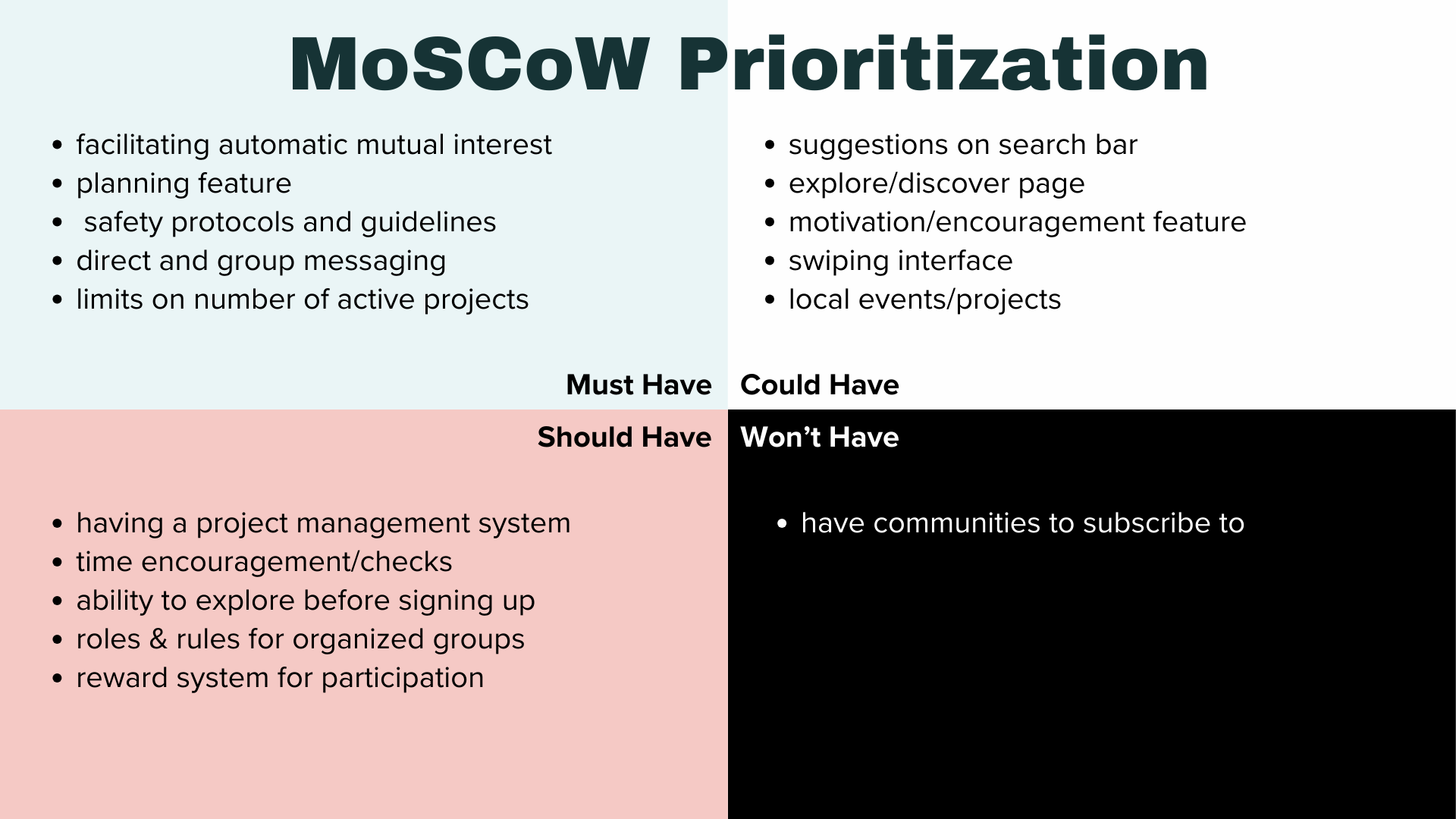
After defining our problem, we moved onto feature prioritization During this step our team began brainstorming features for our app that could benefit users. The method we used was the MoSCoW Prioritization method. Deciding on what the app must have, should have, could have, and would not have.
Prioritizing features led us to gaining a better understanding of what our user would need to meet his goals, and address his pain points. The next step was to create a user journey map to showcase the steps that our user would take to accomplish their goal.

Competitor Analysis | Mind Map | Lo-fi Prototypes
Ideation
Our next step was checking in on the competition. We used Figjam to review our competitor analysis. This allowed us to collaborate and discuss the pros and cons of various apps on the market. After gathering inspiration from a variety of applications, including Bumble BFF, Meetup, and Discord, we felt very confident in how we wanted our app to be designed, as well as how we wanted it to flow.

A snippet of how we analyzed competitors using Figjam
Key findings from various applications
After getting a better understanding of what was already on the market, we devised a Mind Map. This allowed us to organize the structure and flow of our app, as well as include key features and pages that we planned on designing.
Mind Map created with Figjam, key points highlightedAfter creating this map as a team, we were able to use this tool as a reference point as we went our separate ways to design our Lo-Fi prototypes. Below you will see my personal mid-fidelity prototypes that became a solid base for our high-fidelity prototypes.

Sign in screen
Discover Pages
Interests Survey
Project PagesLo-fi User Testing | UI Style Guide | Hi-Fidelity Prototype
Wireframes
Before moving into our hi-fi prototyping, the team decided to perform user testing to ensure that users were able to follow the flow of the user journey without issue.
During user testing, we were able to receive feedback on the parts of our application that needed improvement.
Testing Feedback:
○ missing/non-functional navigation buttons
○ confusing navigation menu
○ basic design concerns
Overall, 4 out of 5 users were able to complete the user journey.

Once the team was satisfied with our lo-fi prototypes, we came together to begin brainstorming ideas for the user interface. Because our app caters to creative individuals, we wanted to take a vibrant and dynamic approach when deciding on a color palette.
After we finalized our color palette we began creating our UI Style Guide. This guide included our color palette, image samples, button states and more.
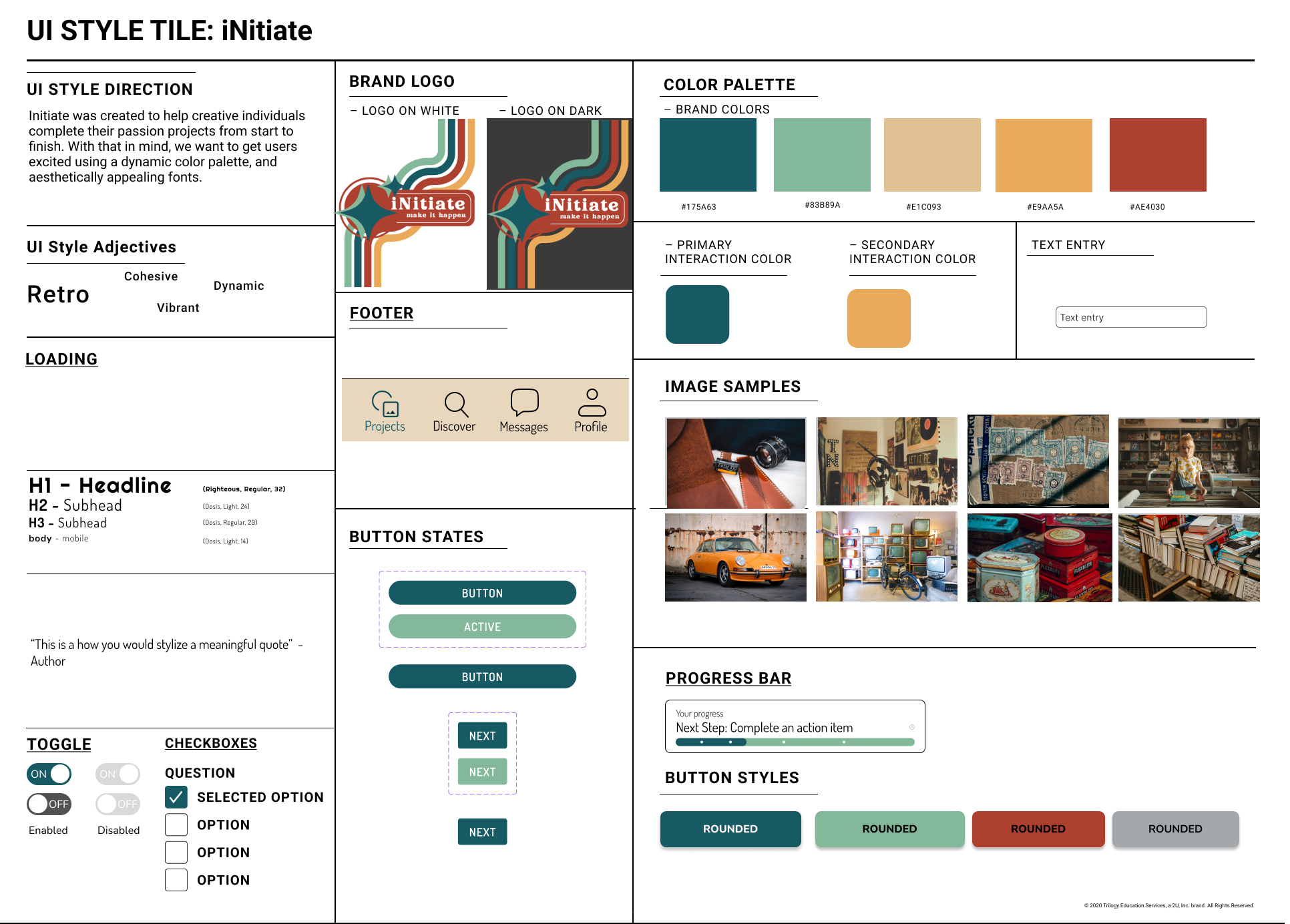
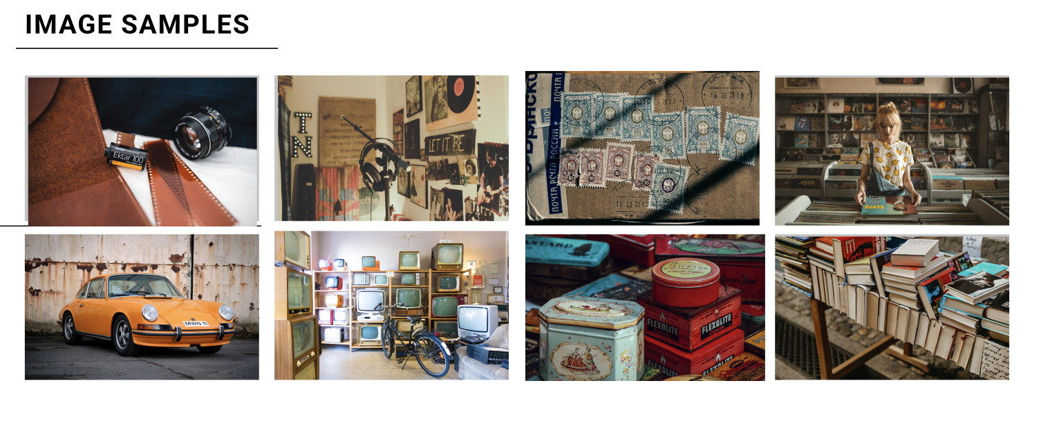
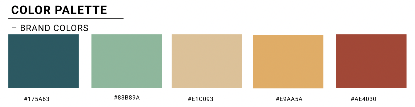
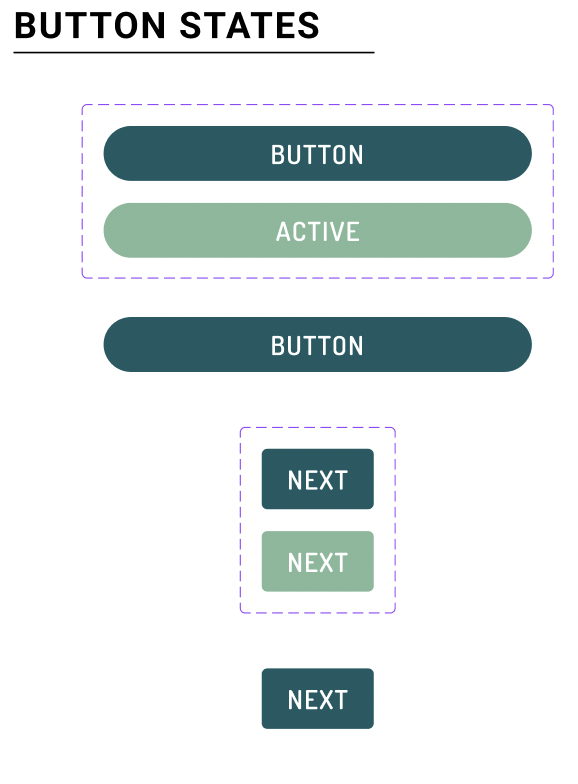
Snippets from our UI Style Guide created with FigmaFinalized UI Style Guide created with FigmaOnce our UI Style Guide was complete, we headed into creating high-fidelity prototypes. Adding these touches truly brought the application to life.
Login or Sign Up Screen


Interests Survey


Motivation Map
Discover Page

Final Prototype
Future Opportunities and Next Steps
-
The ability to host video calls amongst groups so that users would have more ways to collaborate.
-
Implementing a reward system would provide another form of encouragement. This motivation would encourage users to stick to their goals.
-
This feature would allow users to find like-minded peers to connect with in their area using location services.